Technical constraints, edge cases and scoping a version one
With high complexity and zero margin for error, I knew we couldn’t rush into design. So I worked closely with engineers, operations, and product early on to stress-test assumptions, map technical constraints, and build the foundations for a reliable, scalable solution.
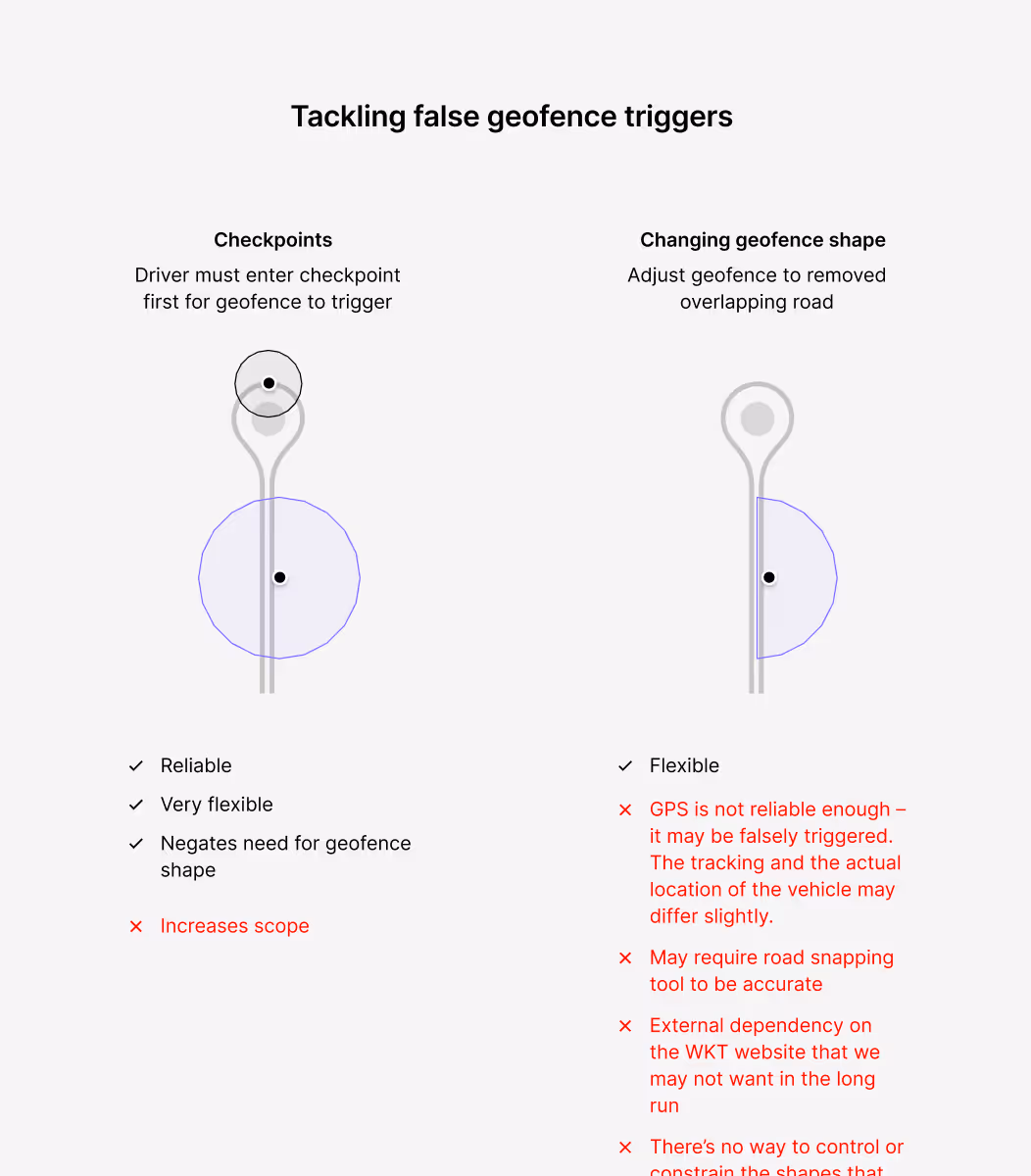
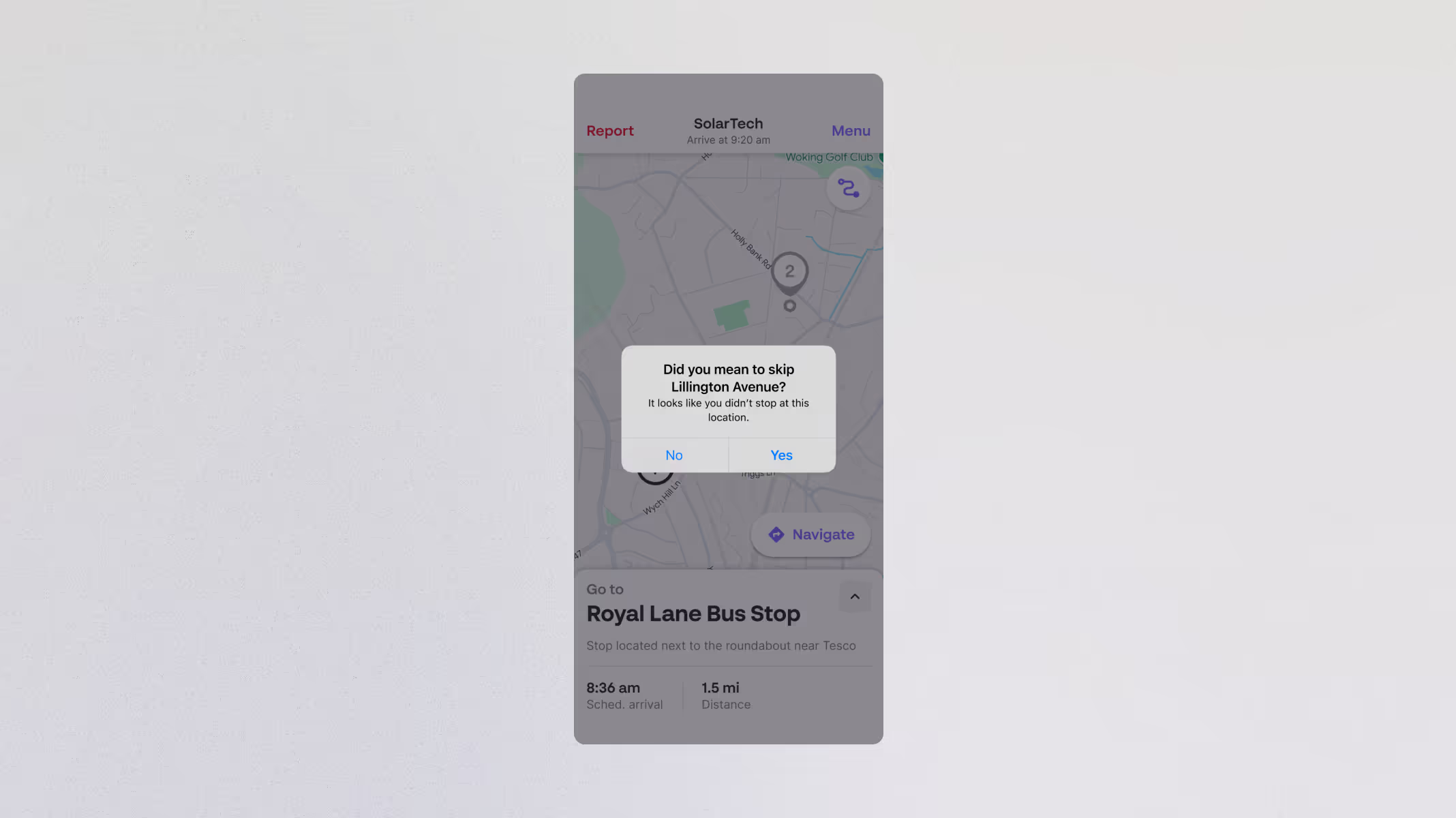
I worked closely with the Android lead and backend engineers to understand the geofence logic already in place and how we might build on it. We discussed edge cases like signal loss, GPS drift, and accidental triggers, all of which shaped how we designed the fallback behaviour. I also explored why polygon geofences were unreliable, and how “checkpoints” might be used to trigger geofences more reliably.
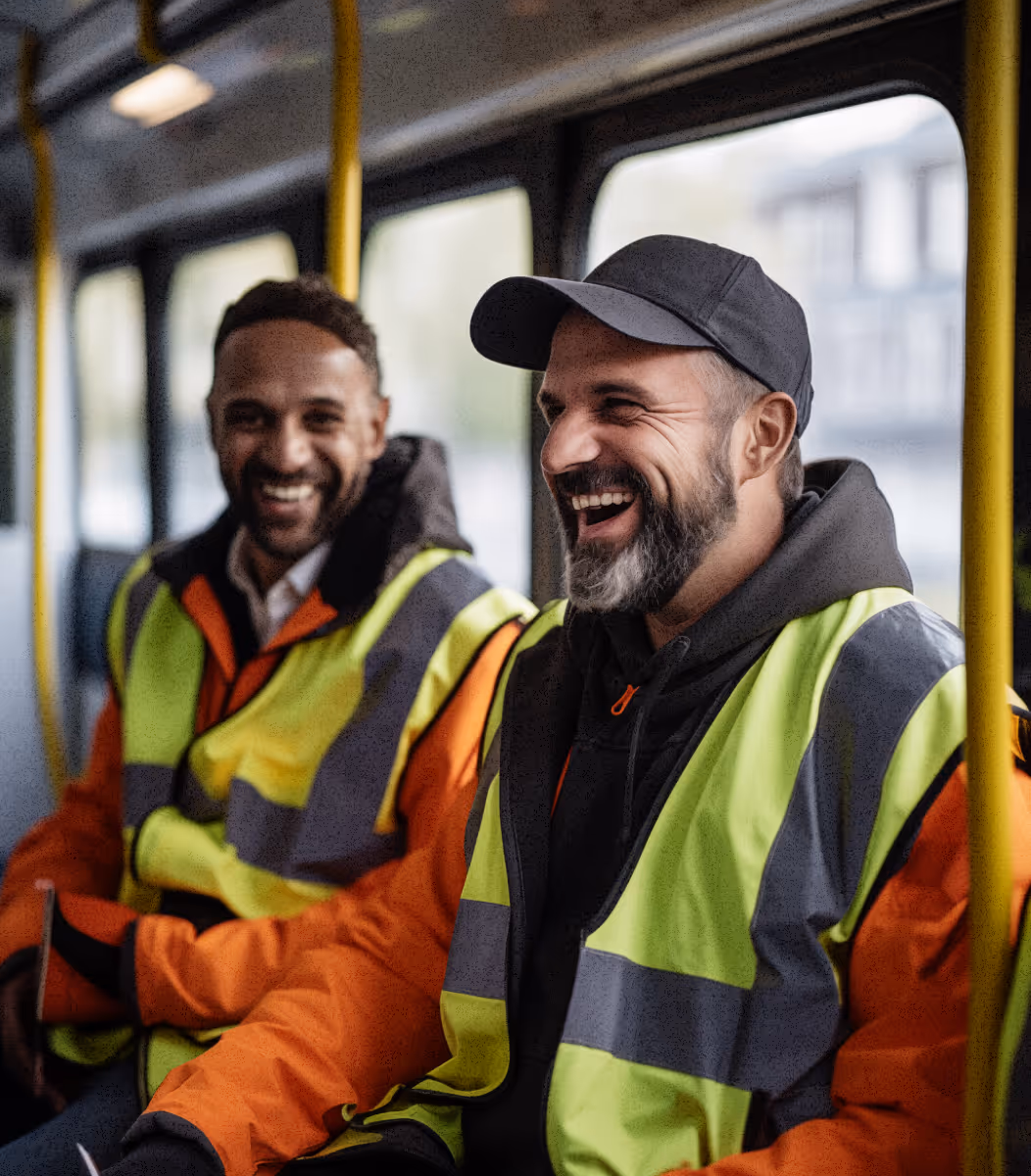
I spoke with Kura’s service delivery team, who surfaced real-world problems with geofencing, like false triggers, and incorrect notifications being sent to parents. Their feedback revealed not only operational inefficiencies but also how easily the current system undermined client trust and support workflows.
Data-led edge case analysis
Following a thorough investigation, we became aware of a recurring issue where drivers could accidentally trigger the geofence prematurely. To help prevent this, we devised a plan to use “checkpoints” – intermediate geofences that ensure drivers follow the correct sequence before a stop is logged. Having run geofencing for over a year in the background for risk mitigation, we could analyse historic data to compare geofence triggers to manual tap behaviour. From this, we were able to flag over 100 stops as strong candidates. While the checkpoint feature was ultimately deprioritised, the analysis directly informed how we could approach tackling edge cases and highlighted the need for a robust safety net.
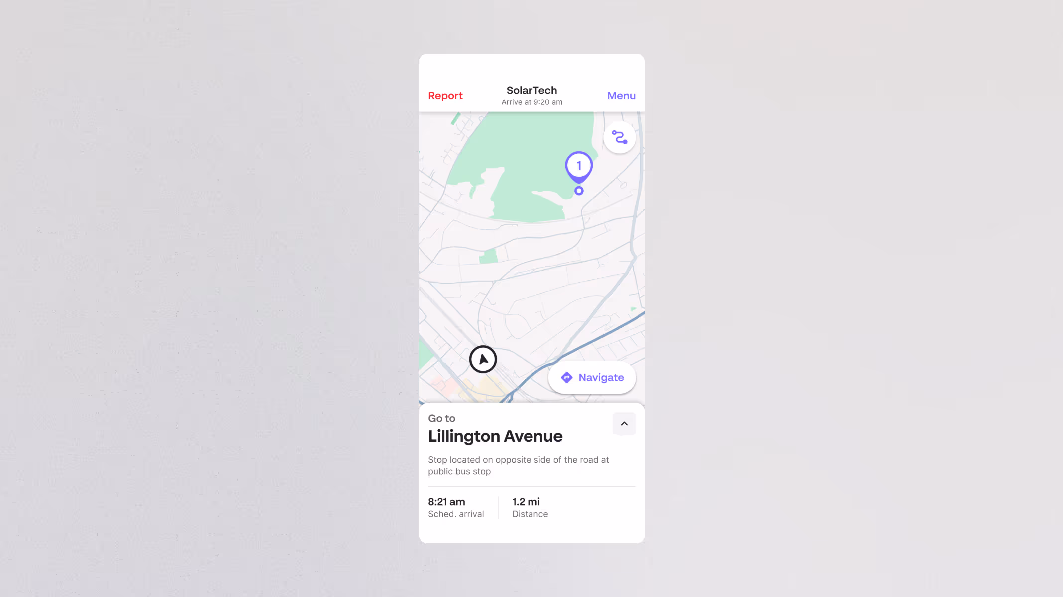
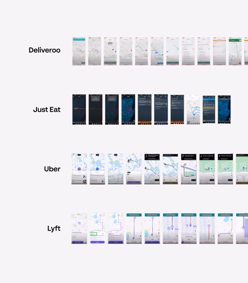
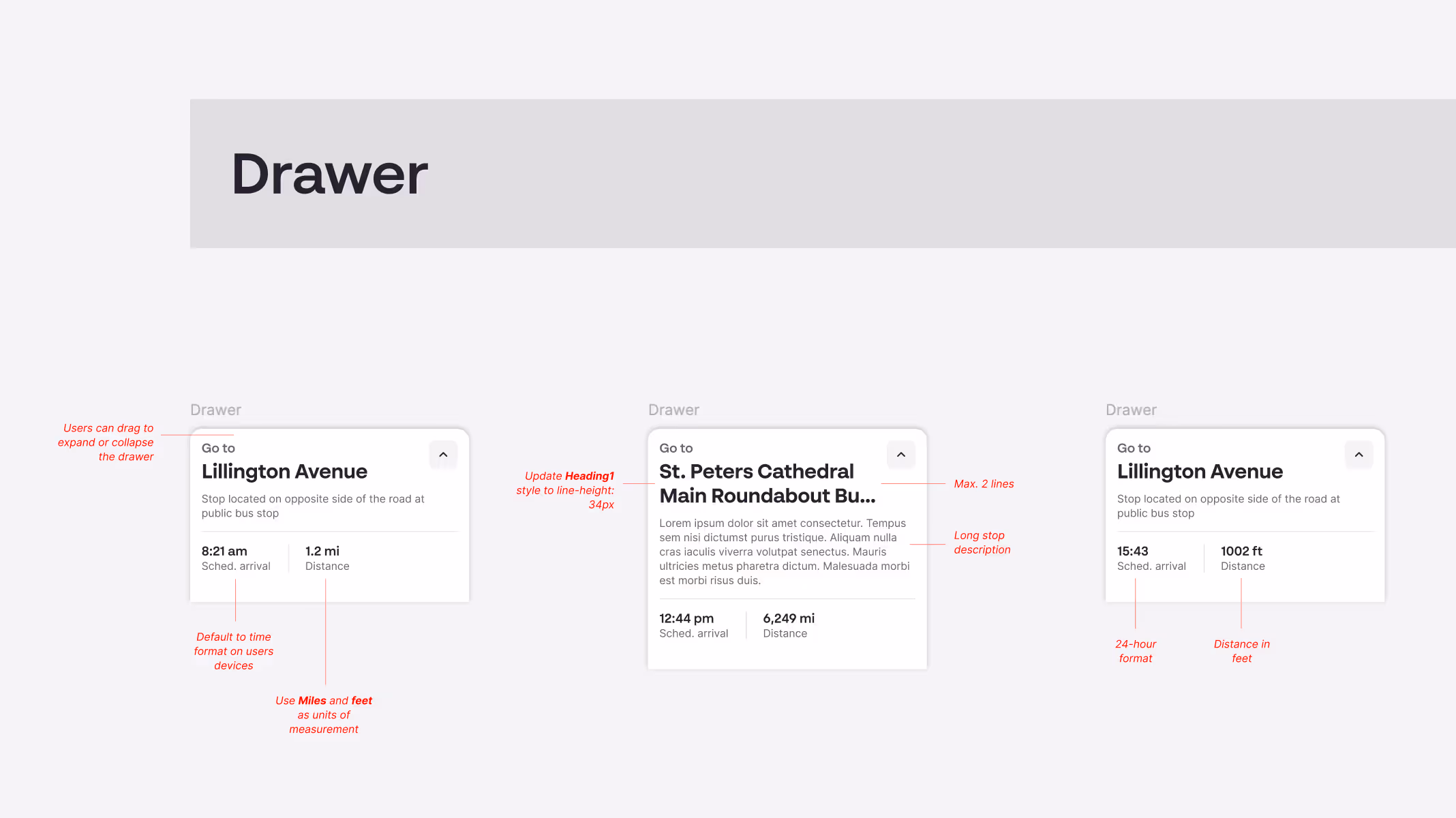
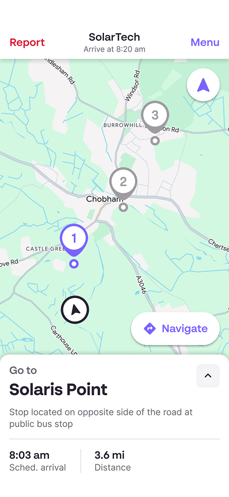
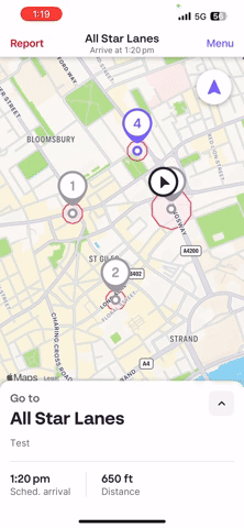
I analysed existing driver apps like Uber, Deliveroo, Just Eat, and Lyft, along with navigation tools like Google Maps, Apple Maps, and CityMapper. I studied how they handled map layout, information hierarchy, as well as interactions and gestures on small screens. I chose to model the experience on existing tools, since I believe in opting for well-established patterns over clever hacks. This influenced everything from button placement to the incorporation of an expandable drawer.
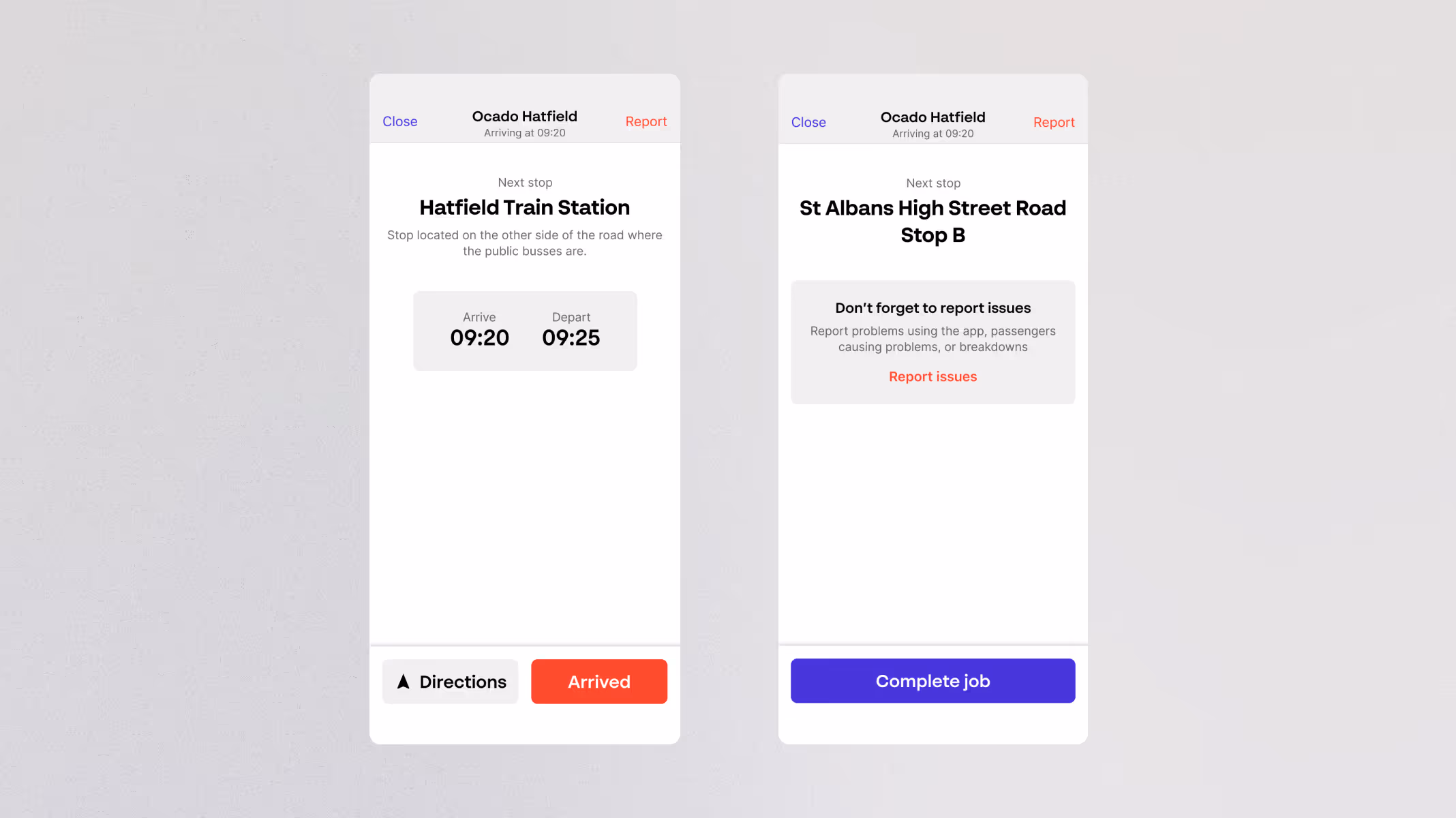
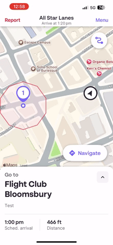
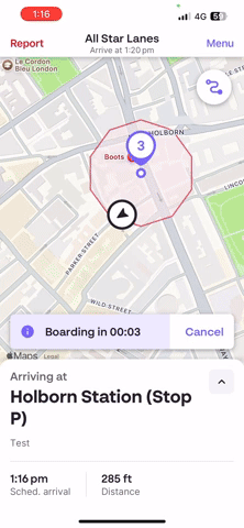
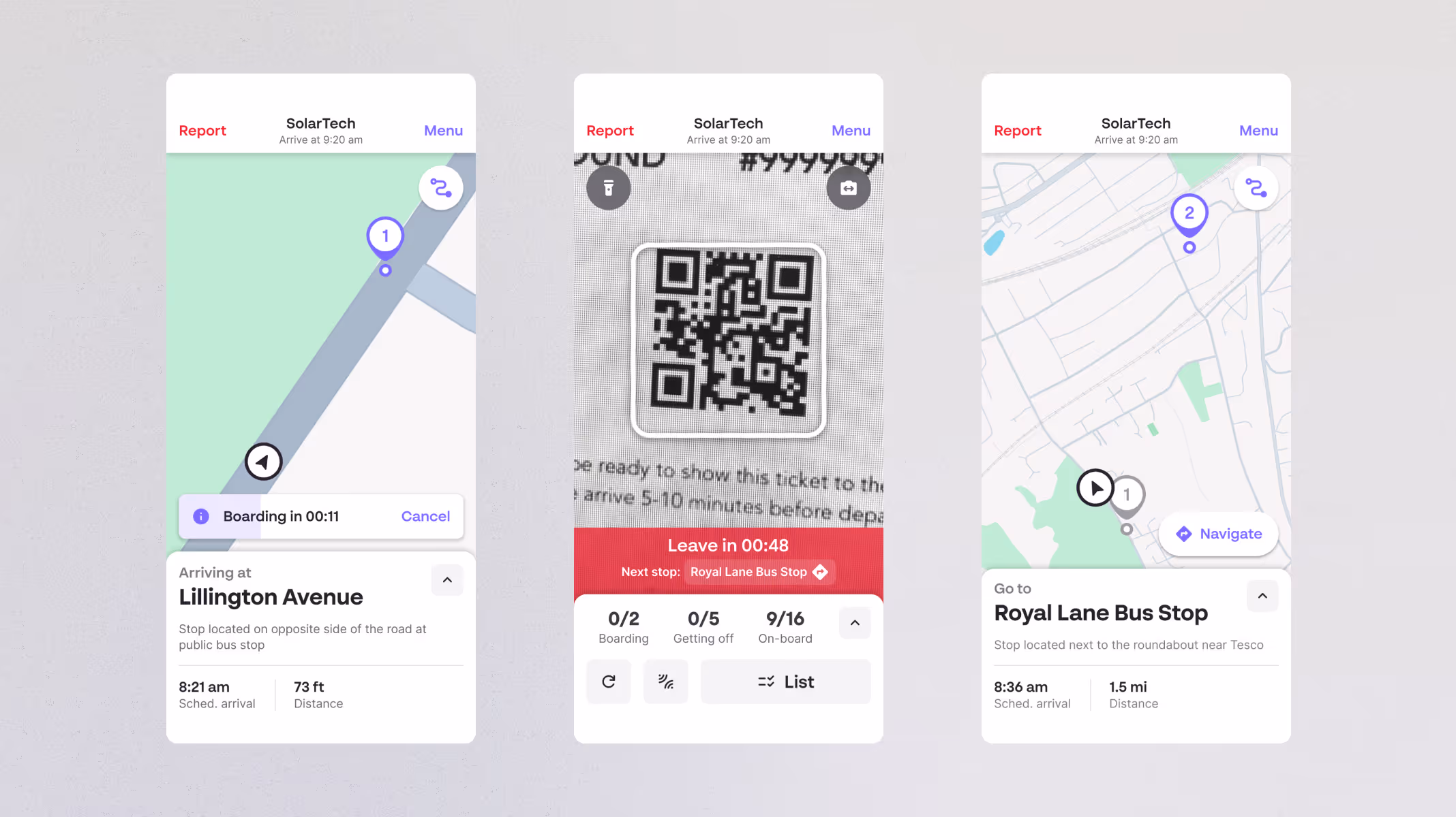
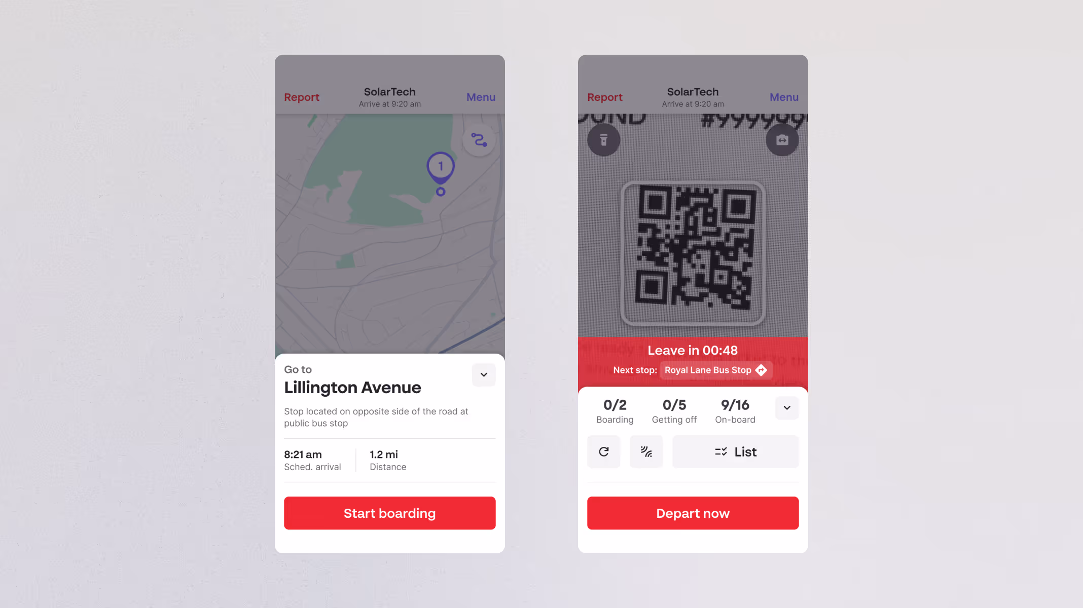
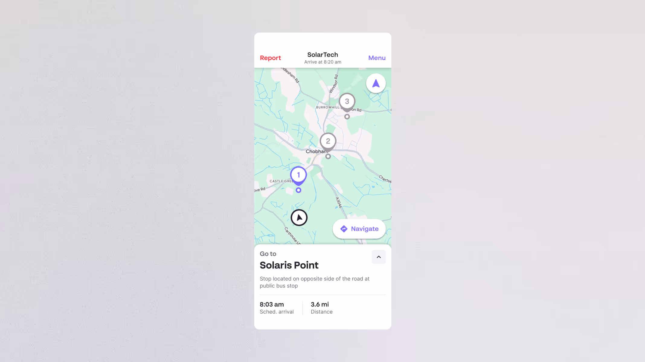
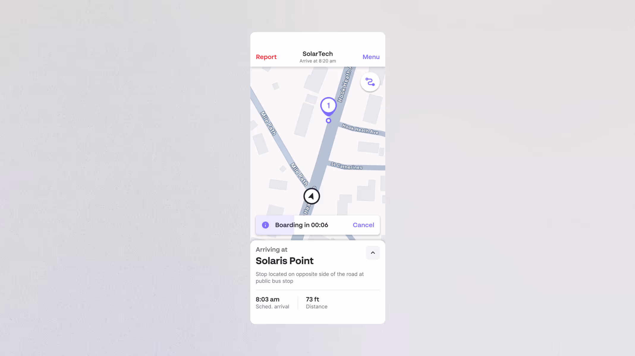
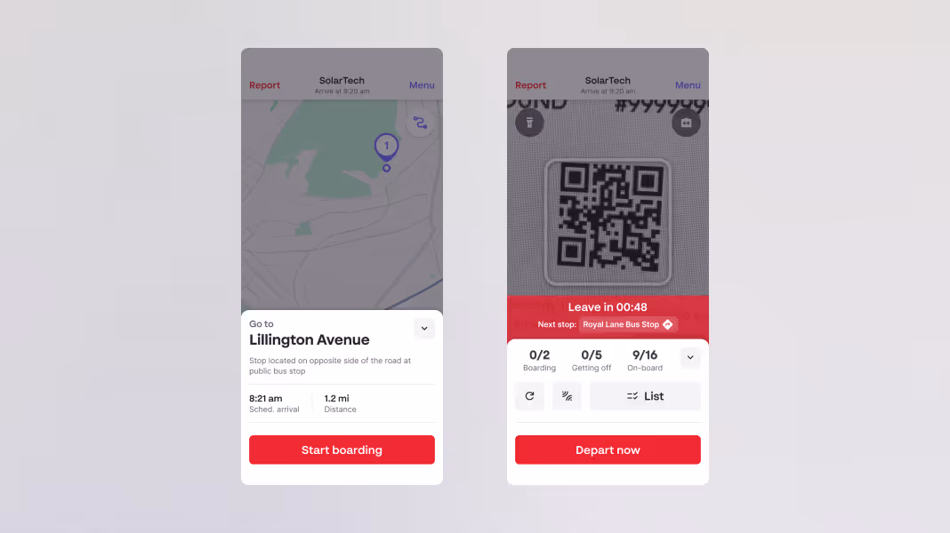
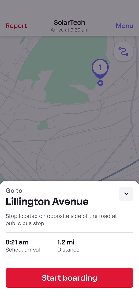
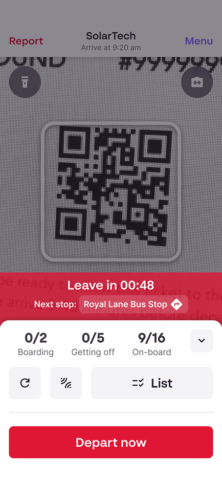
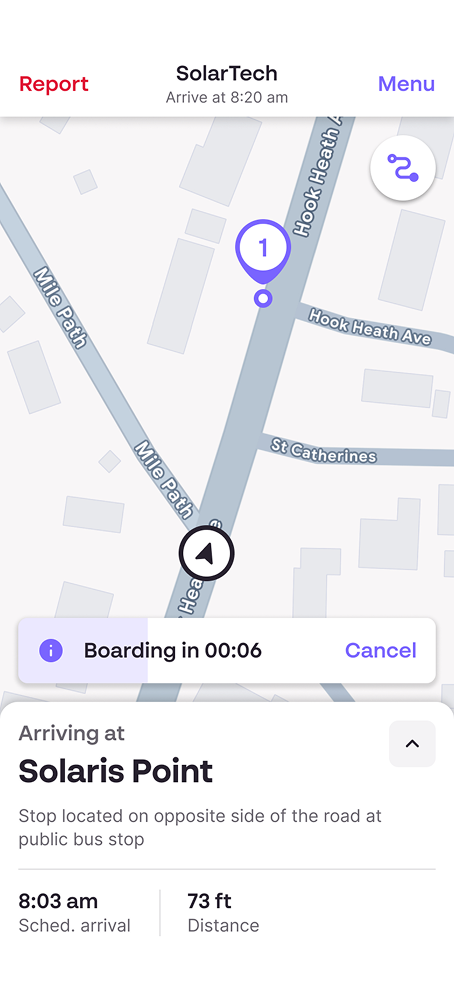
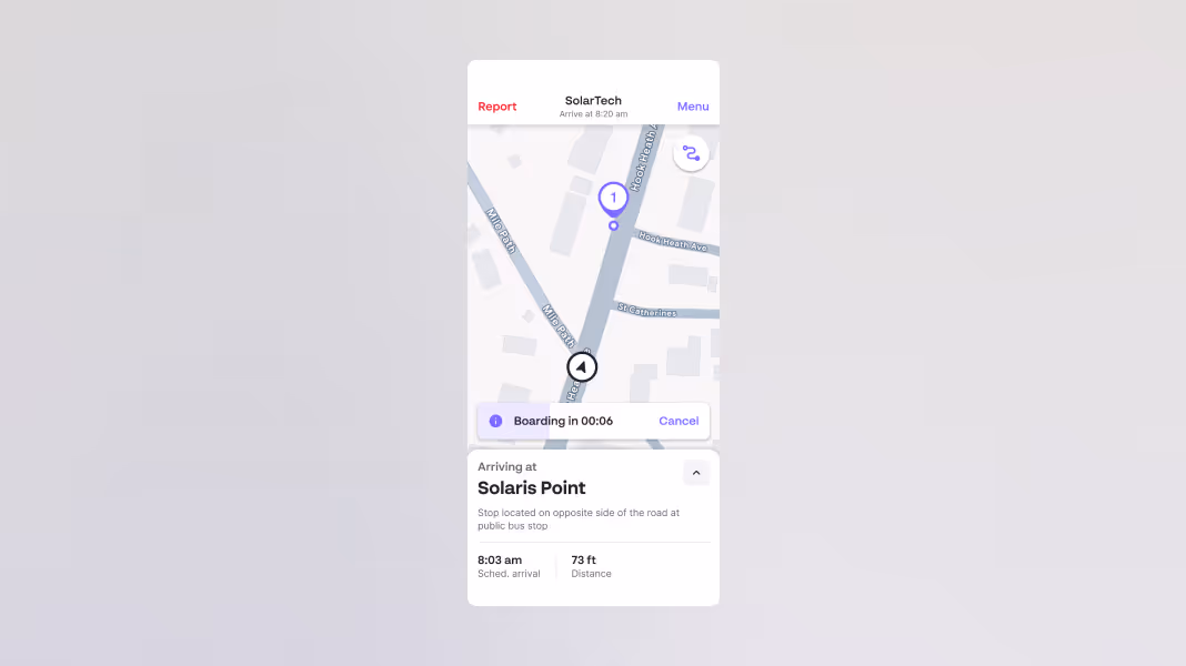
In early planning sessions with product and engineering, I helped shape a realistic MVP. I chose to build on the existing UI rather than starting from scratch, a conscious decision that kept us fast and focused. I pushed for the shift to a map-based view and identified a handful of low-effort improvements (like displaying distance to stop, and stop numbering) that could be layered in without impacting delivery.
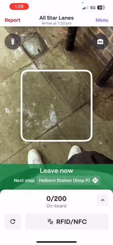
The discovery phase revealed that without the right logic and safeguards, even the smallest errors could trigger false notifications to parents, missed boarding data, and incorrect timestamps. The solution needed to be robust, flexible, and intuitive, with fallback options that gave operations full confidence in its reliability.