Research
UX / UI
Visual design

Revamping the vehicle tracking experience for Zeelo

When Zeelo’s legacy vehicle tracking feature began falling short for clients and riders, I led a ground-up redesign.
Overview

Reimagining a neglected feature

I led the end-to-end redesign of Zeelo’s new and improved vehicle tracking experience, a feature that allows riders to track the real-time location of their vehicle. Previously, this feature was outdated and neglected, presenting a missed opportunity with enormous potential. Zeelo needed to rethink the experience to win new business, reduce client churn, and increase rider satisfaction.

Team

Designer (me)
Product manager
Engineers x4

Duties

Research
UX/UI
Visual design

Timeframe

2024-Present

Results

Played a pivotal role in securing a multi-year deal with a Fortune 100 client that named live tracking its “deciding factor”
Described by riders as “life-changing” and “exactly what I need”
42% increase in feature adoption rate within the first 90 days
Reduced “Where’s my bus?” support tickets by 68%
Two screenshots side-by-side of the new tracking experience
Riders wanted reassurance at a glance: clear timings, vehicle info, and live location.
About Zeelo

The business behind the challenge

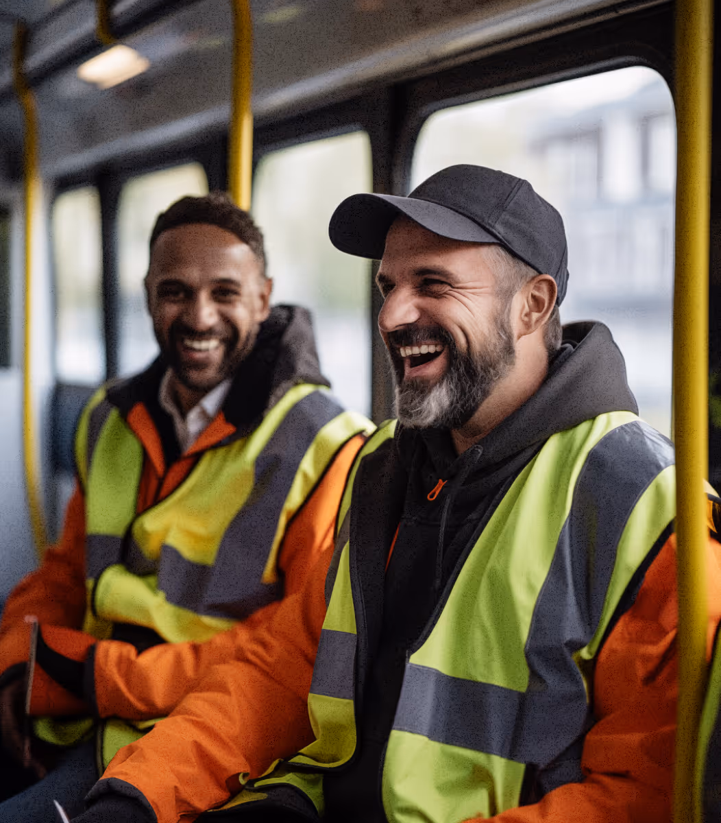
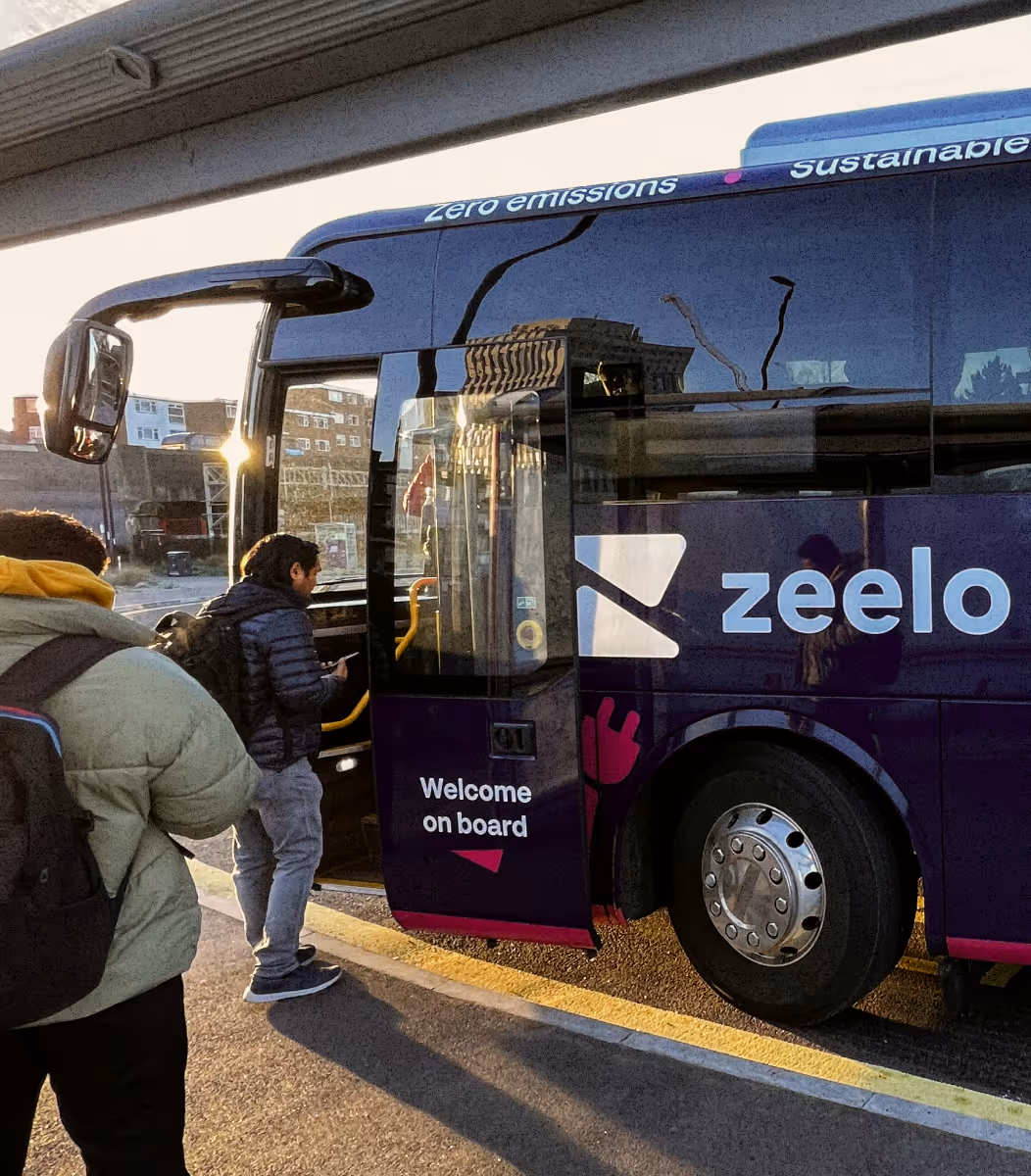
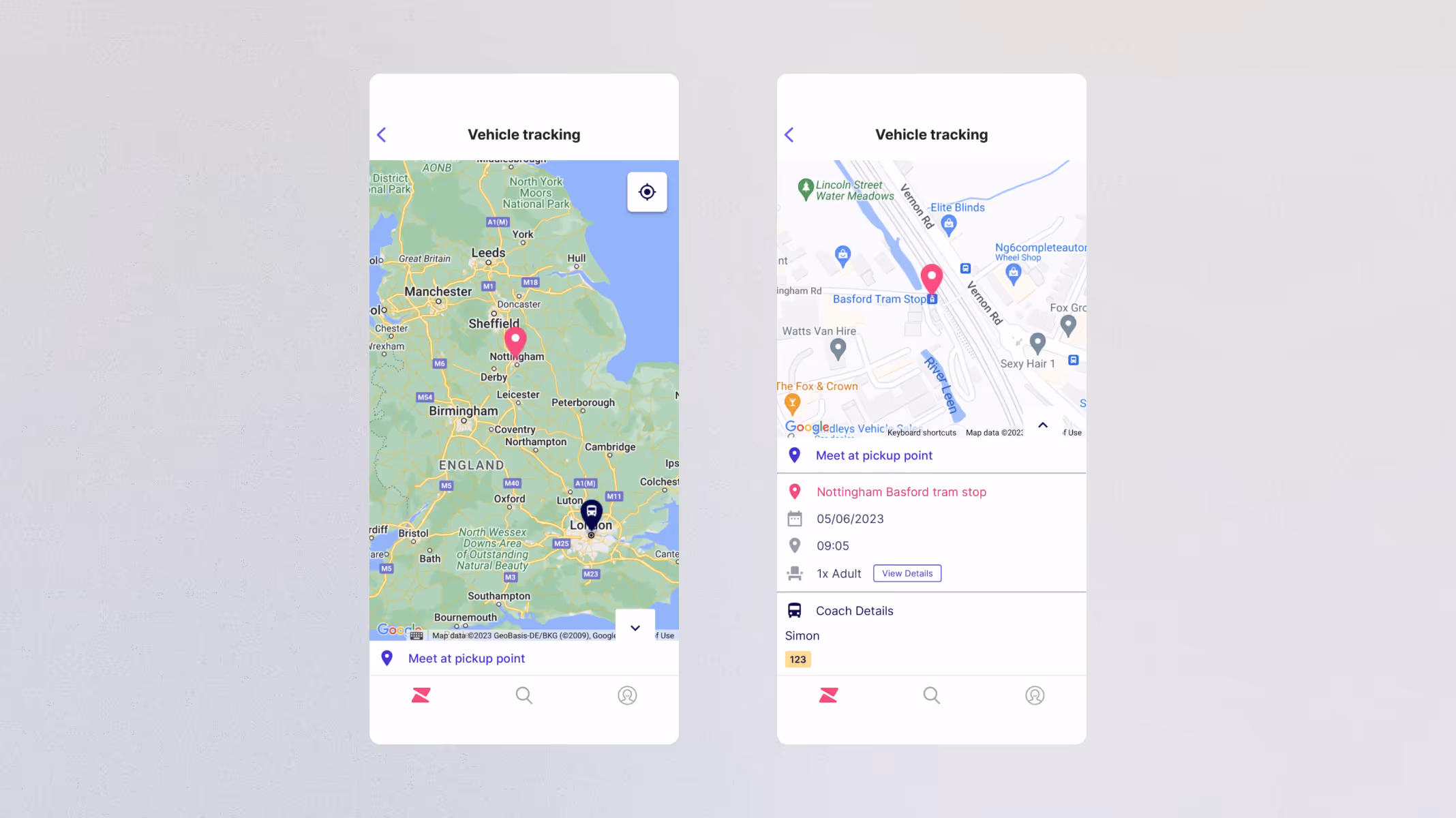
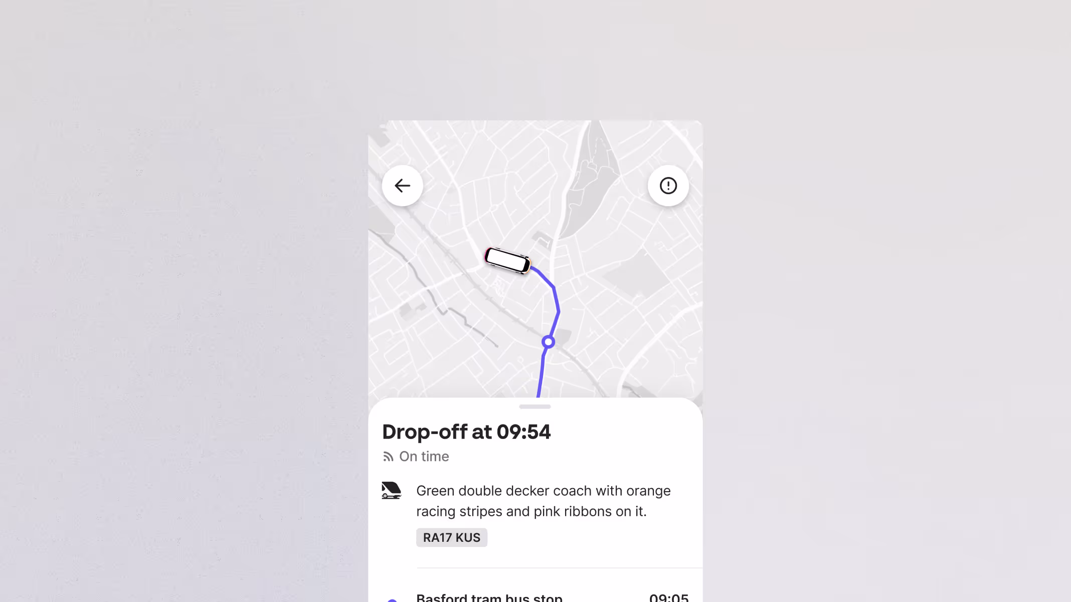
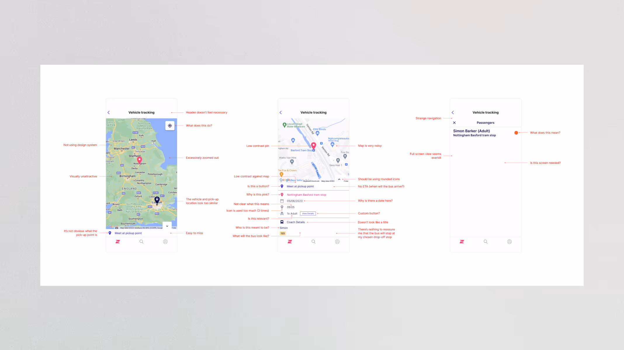
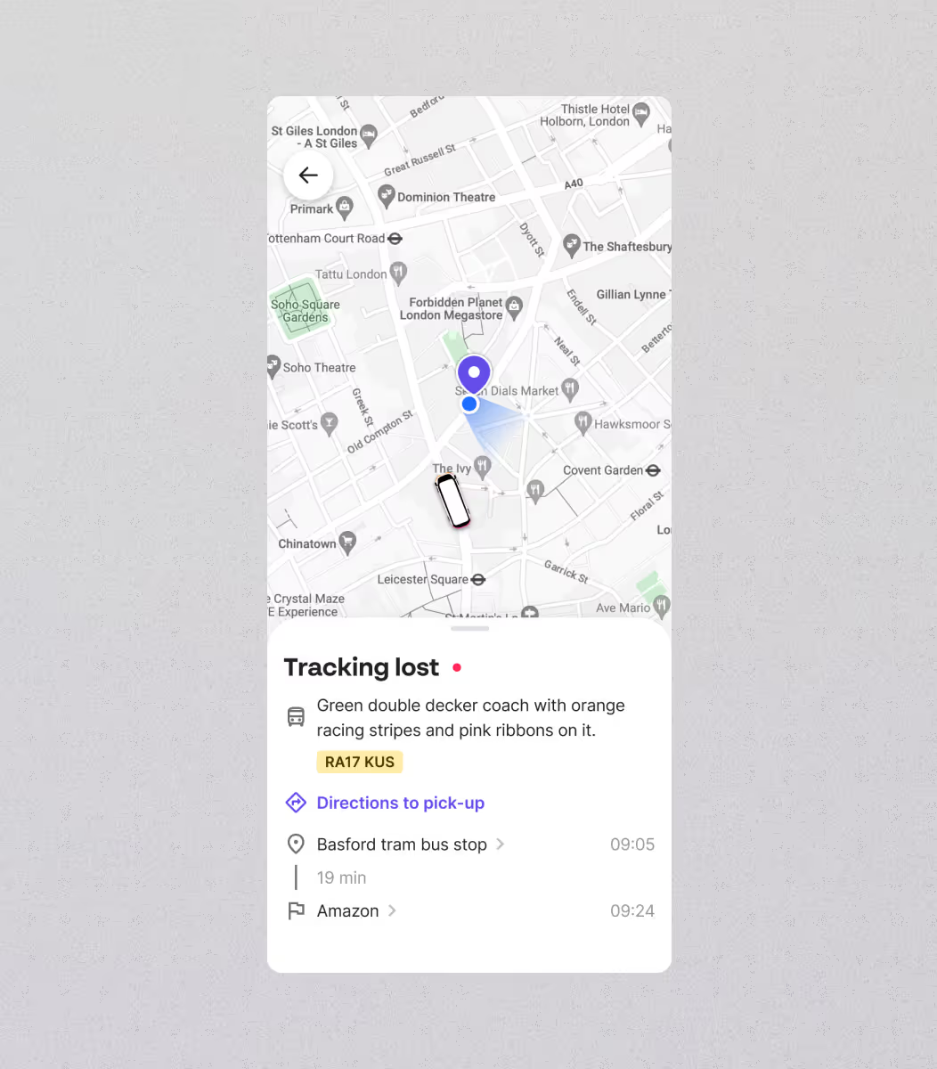
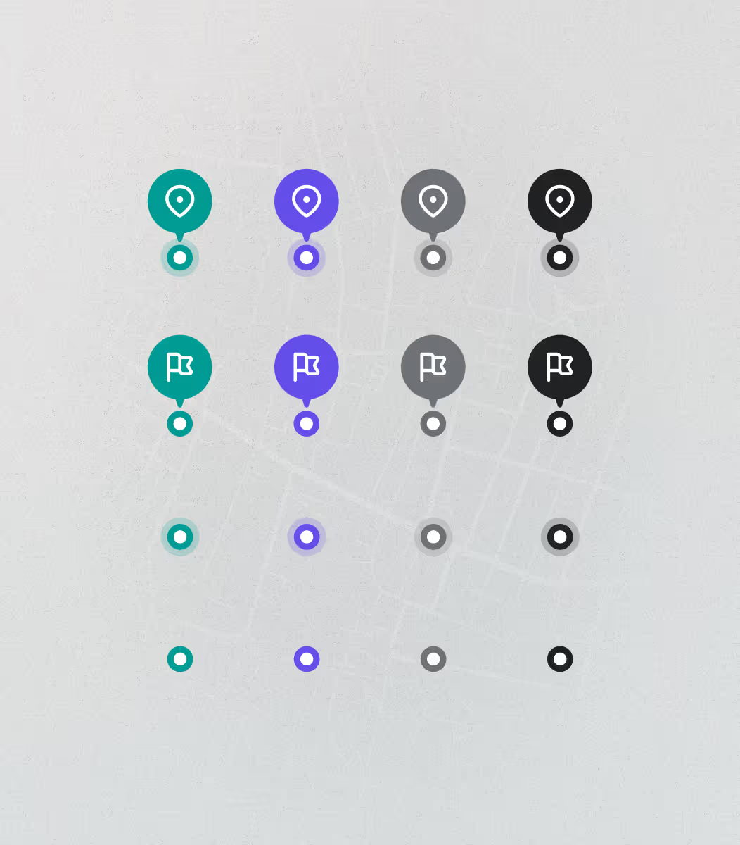
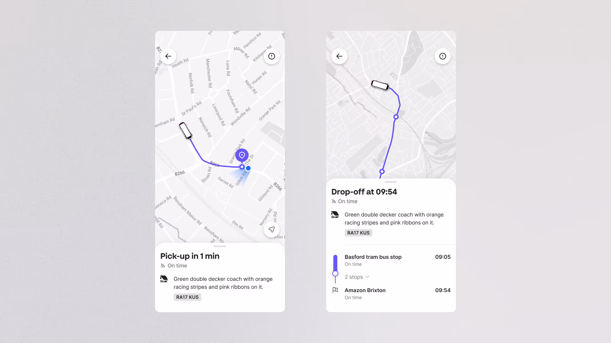
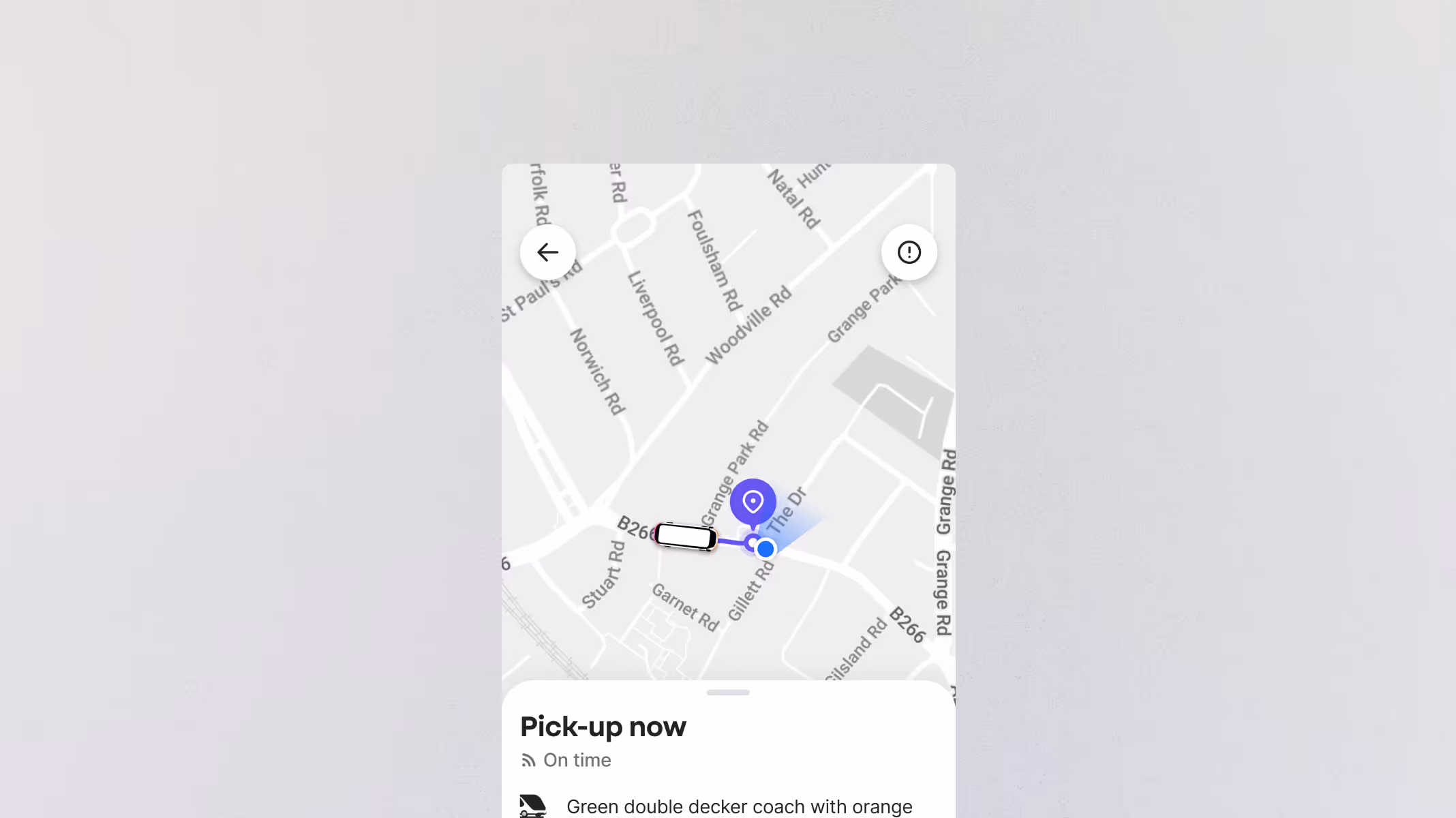
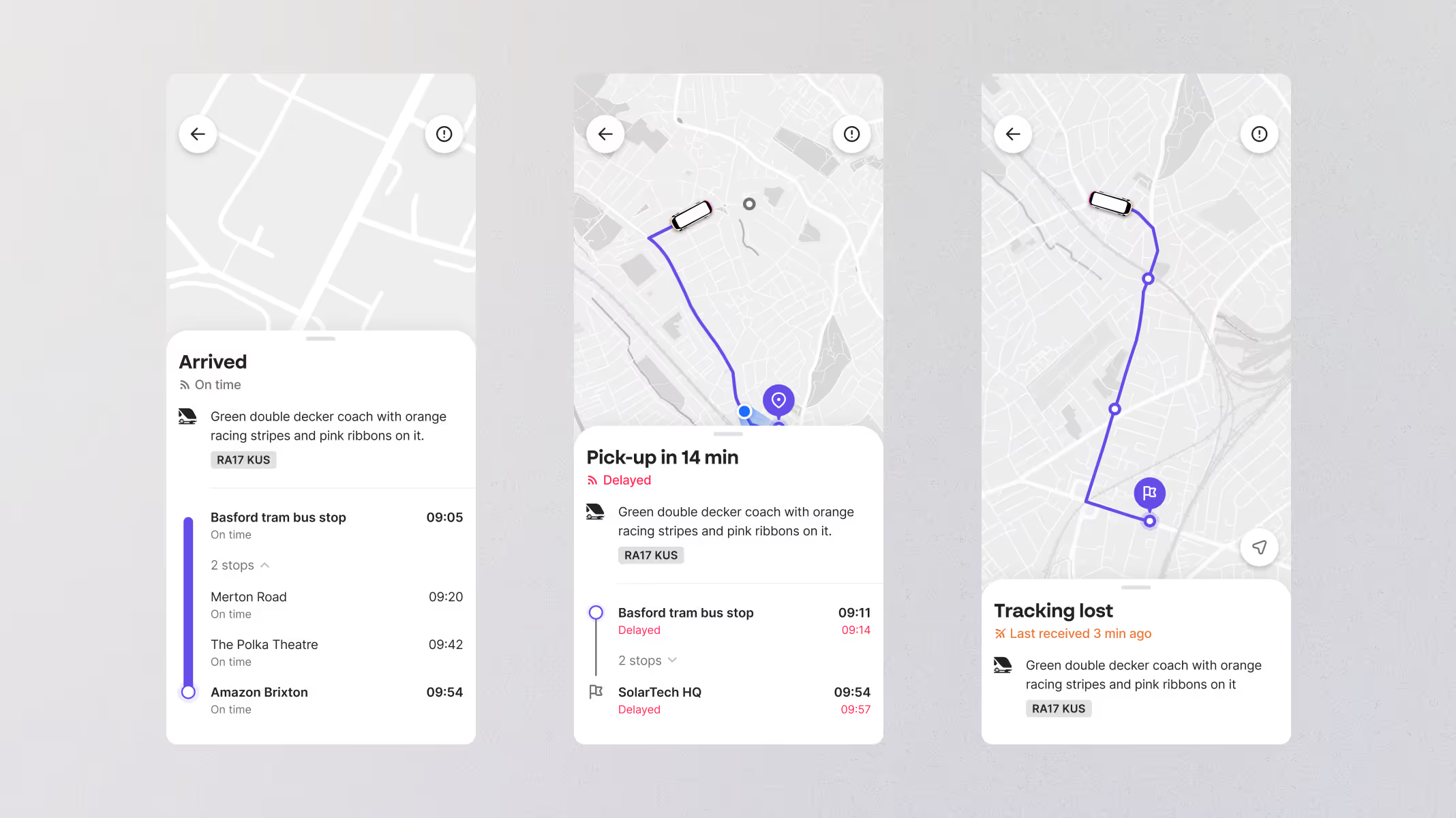
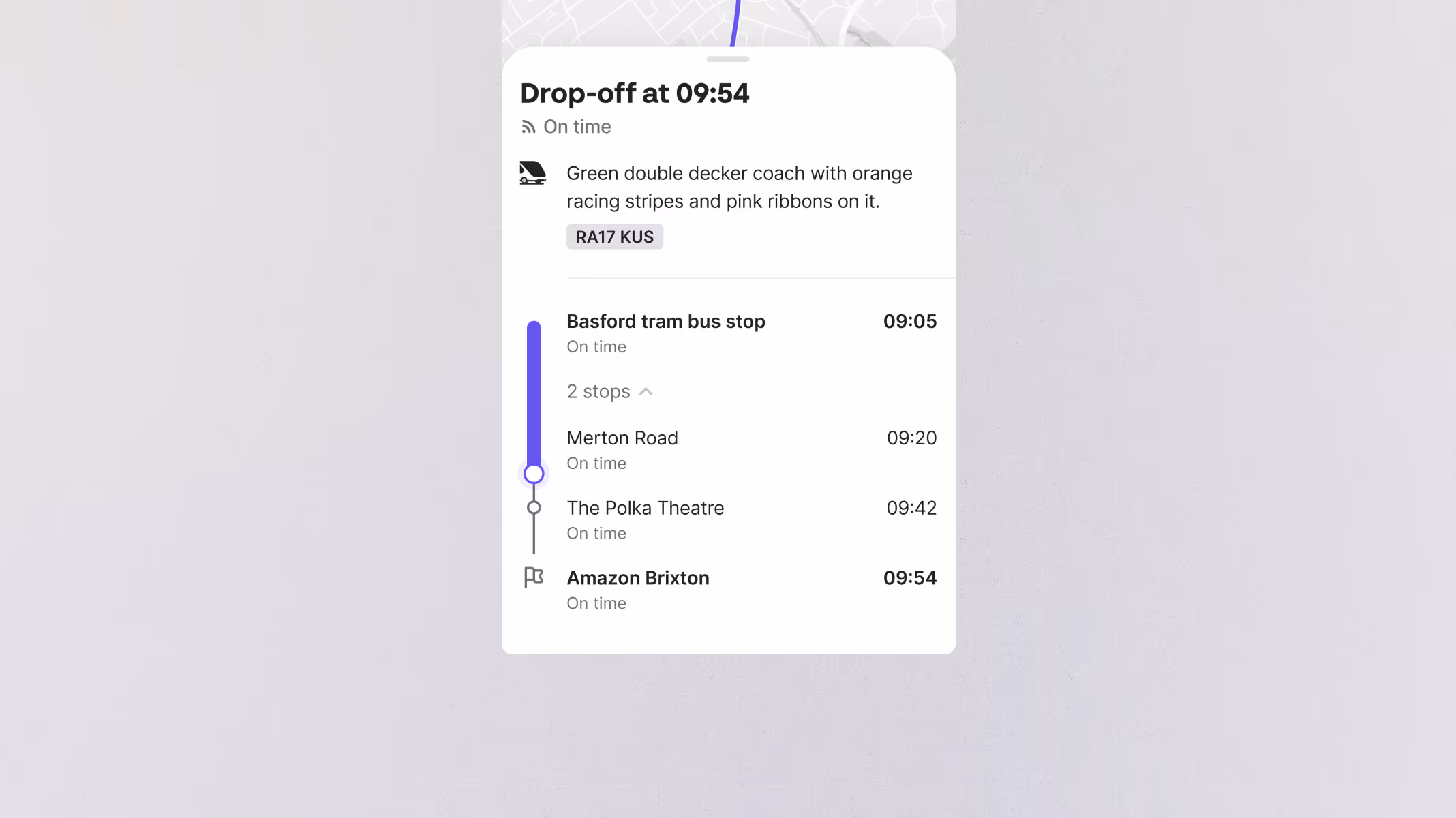
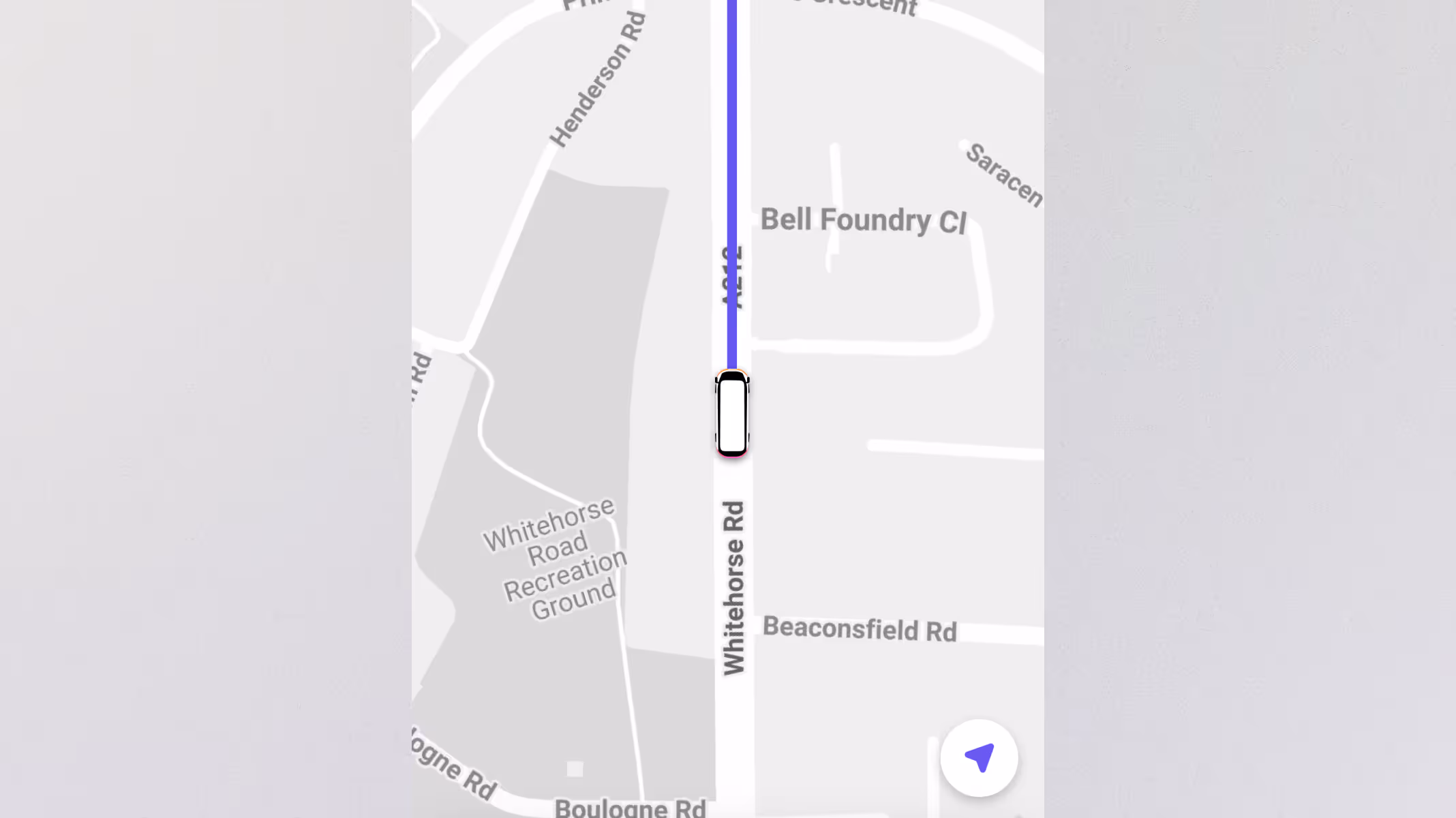
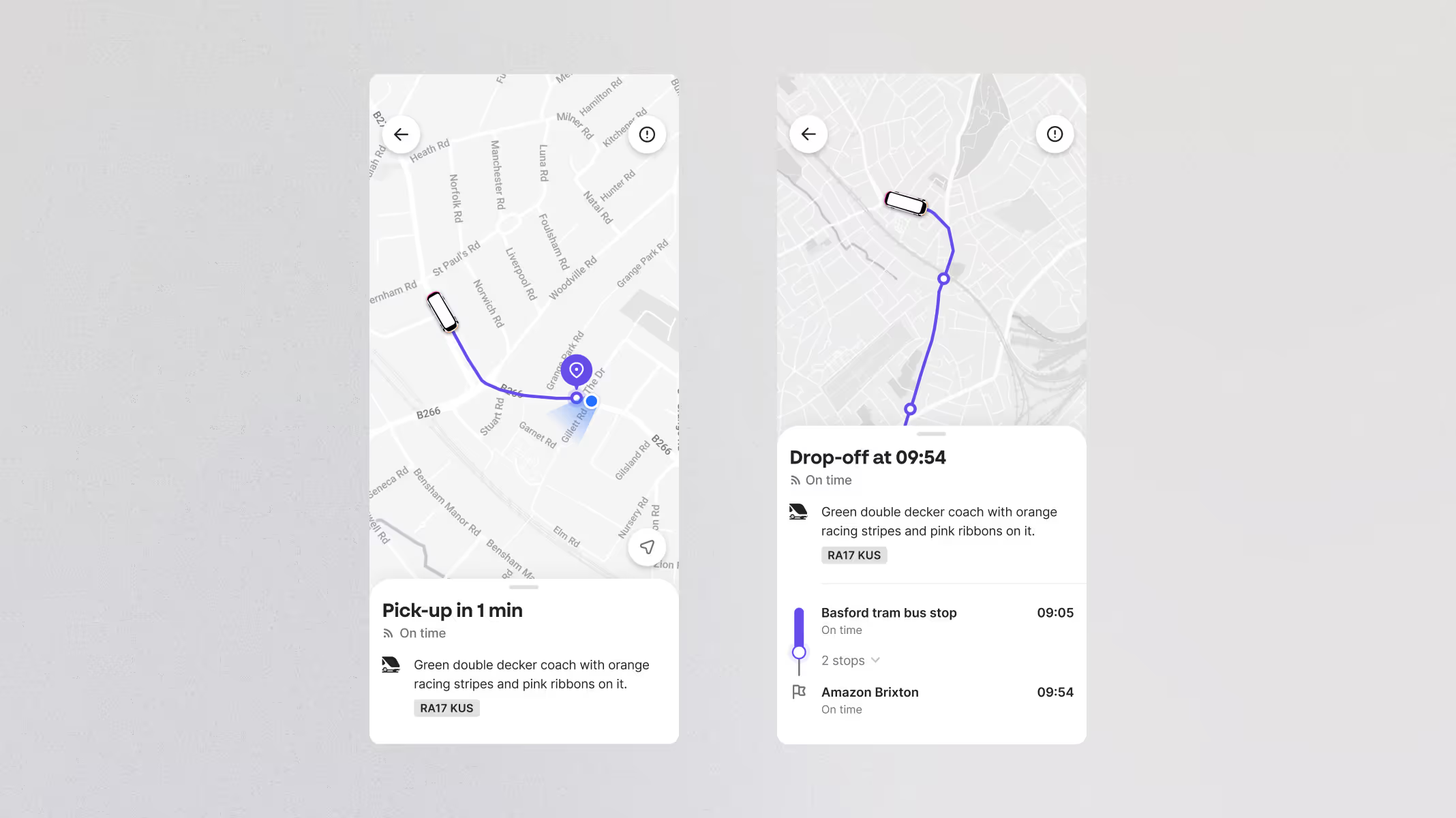
Zeelo is a market leading transit-tech company that partners with organisations to provide safe, reliable, and sustainable transportation for employees and students. Their fully managed service includes live vehicle tracking, 24/7 support, secure boarding, and a user-friendly booking system.
Two workers in high-visibility jackets on-board a Zeelo bus
Frontline workers commuting with Zeelo. Designed to support essential industries with safe and dependable transport.
Workers queueing outside their workplace to board the Zeelo bus
A Zeelo-branded vehicle in service during the morning commute. Trusted by thousands of riders each day.
Problem

No longer fit for purpose

When the tracking feature was originally introduced, Zeelo was a smaller company offering fewer transportation services. As services expanded and became more sophisticated, the feature struggled to meet the new demands, nor did it give riders the clarity and confidence they needed. The legacy version was also web-only, making it slow and difficult to access on the go, especially in contexts where speed and responsiveness are crucial. As clients began requesting “better tracking”, it was no longer just a UX opportunity, it was a critical business move.
Two screenshots side-by-side from the old tracking experience
As Zeelo scaled, the legacy web-based tracking became a weak point. Clients began flagging it as a blocker in conversations.
Goal

Supporting scale with a better experience

The goal was to overhaul the tracking feature to support the growing scale and complexity of Zeelo's transportation services while meeting client demands. The new solution also aimed to provide a drastically improved experience for riders. Crucially, this redesign also marked the beginning of a shift to bring the tracking experience in-app, enabling a faster, more accessible and consistent experience for mobile-first users.
A close up screenshot of the new tracking experience
A cleaner, scalable design that surfaces key journey details without overwhelming the rider.
Discovery

Rebuilding from the ground up

Rather than enhancing the existing feature, I proposed starting fresh. This allowed us to avoid legacy constraints, foster innovation, improve performance, and rethink the UX with today’s needs in mind.
01
UX analysis
Expand dropdown
I started by breaking down the existing tracking experience, annotating pain points across layout, hierarchy, language, and behaviours. This helped uncover issues like unclear stop information, poor error states, and missing journey context. All of which fed into the redesign priorities. These issues were magnified by the legacy web-only format, which made the interface slower and more cumbersome to use on the go.
02
Competitor analysis
Expand dropdown
I analysed competitor and adjacent transport apps to understand industry design patterns and user expectations. This helped benchmark what “good” looks like for tracking experiences, while highlighting gaps where Zeelo could differentiate.
03
Data analysis
Expand dropdown
I reviewed support tickets, user reviews, product metrics, and tracked user behaviour. This surfaced patterns in rider behaviour and underused features, adding quantitative backing to what we were hearing qualitatively.
04
Rider interviews
Expand dropdown
To go deeper, I ran nine one-on-one interviews with active riders. I asked how they currently used tracking, what they expected, and where the experience fell short. Their feedback directly shaped features like live status, clearer stop labelling, and how we surfaced delays. It became clear that riders weren’t just asking for more data, they wanted clarity, confidence, and actionable information at a glance.
05
Stakeholder alignment
Expand dropdown
I worked with operations, sales, and product stakeholders to understand business needs and client expectations. This ensured the redesign not only improved the rider experience but also addressed sales blockers and reduced pressure on support teams.
This early work revealed the most common rider frustrations: no ETAs, unclear map visuals, and missing status updates. Clients also wanted a more polished, dependable experience they could trust with their brand.
A screenshot of a UX analysis
Low clarity, inconsistent UI, and unclear behaviours made this experience difficult to trust or navigate.
Design iterations

Built to scale, tailored for every rider

The solution needed to be designed in a way that scaled, ensuring it would work across all of Zeelo’s transportation services while still feeling bespoke and intuitive. For me, it was important that flexibility didn’t come at the cost of clarity. That principle guided how I structured the layout and components from the start.
01
Design iterations
Expand dropdown
Using insights from the discovery phase, I sketched early concepts and wireframes to explore layout and content structure. These evolved through multiple rounds of iterations in Figma, with regular input from product and engineering. I focused on clarity, modularity, and making live data feel easy to understand, testing different ways to present ETAs, journey status, and stop information. Every design choice was made to reduce friction and surface the right information at the right time.
02
Product definition
Expand dropdown
I collaborated closely with engineers and the PM to scope a realistic MVP, something simple, high-impact, and extensible. We prioritised features like journey status and stop progression, while deferring lower-impact or time-consuming enhancements. This approach gave the team a clear delivery target while leaving room to iterate further based on feedback.
03
Release strategy
Expand dropdown
We agreed on a phased release strategy to reduce risk and deliver value early. The initial launch focused on the core features, with follow-up releases introducing enhancements like stop-by-stop ETAs, enhanced map interactions, and greater contextual support. This approach gave us space to validate assumptions and respond to real-world usage.
Feedback from stakeholders was enthusiastic, with quick consensus around the direction. Together, we balanced ambition with feasibility to ensure a smooth build phase. This collaborative momentum was crucial, it allowed us to move fast without cutting corners.
A screenshot of an early design iteration
An early concept exploring how to handle tracking loss and surface helpful fallback actions.
The new Stop component
I created a new ‘Stop’ component to support a wide range of services, stop types, and journey states.
Solution

Scalable, versatile, and user-friendly

Grounded in Zeelo’s design system, the final designs successfully supports all of Zeelo’s transportation services while delivering an excellent user experience that balances stunning visuals with user-friendliness. My goal was to make live data feel clear and actionable rather than overwhelming, especially for first-time riders. The final designs reflect the principles I care about most, clarity, modularity, and real-world usability.
Two screenshots of the new experience
Designed to support all service types, with a focus on clarity, usability, and calm handling of live data.
A close-up screenshot of the new visual language used
A refreshed visual language that feels modern, functional, and grounded in Zeelo’s design system.
A triple shot of some of the different statuses shown in the tracking
Live ETAs keep riders informed with real-time updates while a journey status shows at a glance whether the bus is on time or delayed.
A close up screenshot of the full route and timings in the app
Riders can monitor the progress of their journey in real-time with a complete view of their route, their current location, and stop-by-stop ETAs.
A close up screenshot of the bus following the route
The route ahead updates turn-by-turn to match the movements of the vehicle, and stops change colour once they’re visited, keeping riders oriented.
Results

A new milestone for the rider experience

The redesigned tracking experience was a turning point. It now supports all of Zeelo’s transportation services and received overwhelmingly positive feedback from riders and clients. Zeelo observed a staggering increase in feature adoption rate, and most importantly, it became a key differentiator in sales conversations. Tracking went from being a product gap to a competitive advantage.

Key results

Played a pivotal role in securing a multi-year deal with a Fortune 100 client that named live tracking its “deciding factor”
Described by riders as “life-changing” and “exactly what I need”
42% increase in feature adoption rate within the first 90 days
Reduced “Where’s my bus?” support tickets by 68%